 Something for the weekend sir? How about a simple means to get visual and tactile feedback from node-red-dashboard buttons?
Or rather than large buttons – icons you may create or obtain yourself in a node-red-dashboard template.
To backtrack: For my own home control endeavours, I’ve been using a number of visual interfaces over time as some of you know – we’ve discussed in here – Imperihome and Blynk for example.
Recently I’ve been taking a look at Node-Red-Dashboard. Originally called Node-Red-Contrib-UI this has come a long way in recent months and I think is worth more investigation because of it’s ultimate flexibility.
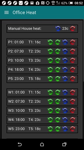
I needed a set of controls for my thermostats – you’ll see an example in the image on the right. As well as turning heating up and down (and I have two separate systems for my office and home) – I have for some two years now had Node-Red handling 5 time-zones during the week and 5 at the weekend as well as frost fallback and holdoff controls (so we can turn the heating to frost setting if we pop out for the day (or for 6 months in one case)). Also as one of our properties is holiday rental, on the odd week it is not in use, it is handy to be able to stop down the heating for a few days, secure in the knowledge it will automatically turn back up when the time interval is done.
At the user end, I’ve used Imperihome for this and Blynk – and neither are ideal as I need so many controls. Blynk controls are just too big and the slider values are not separately programmable – that is I can’t get them to show hours and minutes. Imperihome has controls for every imaginable device – but very few “generic” controls.
 The Node-Red-Dashboard template has always been my favourite option but in the past seemed complicated and control over I/O was limited. Not any more. As you can see, it came to the rescue with a little coding. The standard numeric up-down control in the dashboard is BORING with an awful pair of up-down arrows with no kind of feedback. History.
The controls you see here are my own effort – all in one template – and hence I have more control over the vertical spacing without which this would take several pages.
So – for any given control you are looking at programme time, temperature for that programme, up and down controls for the programme time and temperature. A feature of the template control (un-tick both arrows in the setup window) separates inputs from outputs – so you can fire information into the node and use that for display only – and buttons can fire values back out – but the standard buttons were WAY too big – so – I used images. Each section here is nothing more than a standard DIV with 3 spans – the final span holding four images.
[pcsh lang=”js” tab_size=”4″ message=”” hl_lines=”” provider=”manual”]
<div layout="row" layout-align="space-between" style="padding:0px; text-align: left; margin:2px; border:2px solid black;">
<span style="width:28%;padding-top:5px;padding-left:5px;">{{"P1: "+ msg.payload.p1}}</span>
<span style="width:28%;padding-top:5px;padding-left:5px;">{{"T1: "+ msg.payload.t1 + "c"}}</span>
<span style="width:44%; padding-top:3px;">
<img class="lightup" src="https://xx/icons/timed.png" ng-click="send({payload: 'p1dn' })" height="24px"/>
<img class="lightup" src="https://xx/icons/timeu.png" ng-click="send({payload: 'p1up' })" height="24px"/>
<img class="lightup" src="https://xx/icons/tempd.png" ng-click="send({payload: 't1dn' })" height="24px"/>
<img class="lightup" src="https://xx/icons/tempu.png" ng-click="send({payload: 't1up' })" height="24px"/>
</span>
</div>[/pcsh]
I’ve shortened the URL for the images (any old publically available place) to fit onscreen. I put them on my website in a folder called “icons”- but that’s arbitrary.
So – you’ll see the “moustaches” {{}} surrounding incoming information – my first ignorant thought when using one of these templates was that you were limited to msg.payload – but no you are not – you can send an entire object in there. Hence the page is a series of the above DIVs. Each image (used as a button) sends out a unique message and a simple lookup table decides what to do with them.
So above, the blue template is the page you see up at the top – the output is passed to a function in which you can use a case statement to decide what you want to do with each button press. The second function is triggered every couple of seconds and formats your various settings into an object for injecting into the function (in case these values are altered elsewhere, you want to see changes appear on your phone display). The output from the first function ALSO feeds that function so any changes you make with the buttons – once processed – show immediate changes in the values you see in the topmost image.
So – all very nice – press the anti-clockwise time or clockwise green images – the times change (in my case in 15 minute intervals but they are actually stored in minutes – hence the second function does a bit of formatting).
But it is all very boring – you get no visual feedback from the images – and no tactile feedback from the phone. Well, let me say that I’ve spent several hours going down blind alleys – and learned a lot today. The end result – visual “brightup” icons when you press them – AND full tactile “vibrate” feedback on mobile devices.
[pcsh lang=”js” tab_size=”4″ message=”” hl_lines=”” provider=”manual”]
<script>
function restore_icon() {
        $(this).attr('src',$(this).attr('src').replace("_b.png",".png"));
    };

$('.lightup').on('mousedown', function() {
    $(this).attr('src',$(this).attr('src').replace(".png","_b.png"));
    setTimeout(restore_icon.bind(this),500);
    navigator.vibrate(100);
    });
</script>
[/pcsh]
And it is SO easy once you know how.
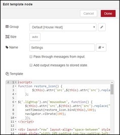
It turns out you can use jQuery inside the templates – which is awfully handy – and a modern line to control the buzzer.
When you create or use a (.png) (transparent) image you want as a button – make another with a suffix “_b” for bright. The code below on press replaces the image with the bright version and shortly thereafter with the original. At the same time the excruciatingly simple vibrate line makes the phone vibrate briefly. You have no idea where I’ve been with this – but note it is a recent addition but modern phones and tablets should handle it.
Note the class=”lightup” in the above img definitions. Stick this code at the top of the template and all will work magically..
The second part of this code changes the image to the bright version and starts off a short vibrate – while setting a timer at the end of which – the original image is replaced. It is that simple. Because I don’t refer to the actual image – you can have several different images which will operate in the same way.
I’m no CSS expert but with a little care and reading up you can make a pretty control page all in one template completely under your control – and of course – making the alternative image brighter was just my idea – you may chose another path. “Blynk”-type controls should be a doddle.
Have a nice weekend.
Enjoy.


OK fair enough I understand your reasons. Unfortunately I don’t have experience with JavaScript or HTML. Your example certainly pushes the boundaries of what Node-Red can do.
youtube is full of good courses, and you can even accelerate them to 1.50X 😀
Oh, I’m only just getting started. Seriously – I’ve given you most of what you need. That example is a simple image load – standard html – with the addition of a class to get the feedback – and an Angular directive as per the examples in Node-Red Dashboard. Try the examples they give.
Very nice indeed Peter, have you put the code for the various nodes on your website or code repository by any chance? Have a nice weekend too.
Hi there
No because once again – they are specific to my needs and I don’t want to get into a whole question and answer thing about them. The info here should be sufficient to get anyone familiar with html and a little javascript up and running.