Some time ago I wrote about HighCharts – a wonderful set of Javascript tools for doing graphs – and I gave an example of getting the graphs into Node-Red. I’ll not repeat that as you have the link above. At the time I’d not added in databases, I’ve since made some VERY simple code to bring in the charts from SQLITE – I have to say it isn’t the fastest code in the world so I won’t embarrass myself by replicating it here. But at the time, my only limit was Node-Red Dashboard – there was as far as I could tell no way to get full screen or anything like it on a PC – until I took the plunge today and ask the right people – turns out that you can set an individual page in Node-Red Dashboard to WAY past the normal 6 blocks width simply by altering the size of a GROUP used only on that page.
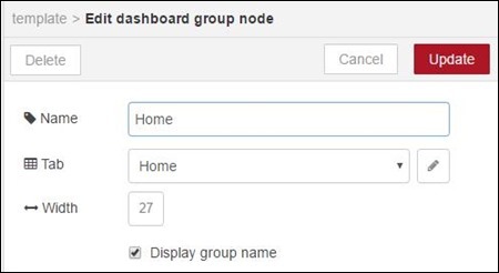
So given block sizes set by default to 48px per block – by merely changing the maximum width in blocks you can easily get to full screen size for a given page – while leaving others alone. The result, using HighCharts (their JavaScript is free for personal use – you pay for commercial use)… below you see info I’ve been collecting in SQLITE3.
In the above image you see multiple lines, with missing point filling, from 27th April until now – taken from a single SQLITE table where I have different topics for different lines and I store the value and date (and that’s about it) – I call the table “timeseries”. So I pull out what I need, sorted into topics – and fill in the info required by HighCharts – the best way to pick this up is to read my blog item above and go have a play on their site.
And so it was that I got the full screen I wanted and one of the guys in SLACK said “have you tried PLOTLY?” Well, I went off to their site and this was all commercial and you could pay so much a month – didn’t much impress so I went back into the conversation only to be told I was looking in the wrong place, had I noticed their OPEN SOURCE JAVASCRIPT?
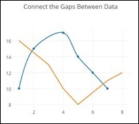
I hadn’t of course but here’s the link. Free for you and I to use. Better – it is also easy to experiment with it online as they use CODEPEN for demos. So click on that CodePen link and you’ll see some code you can mess with and this result…
You will see JS code you can mess with to change values – one of the things I like is smoothed lines. So where you see “mode: ‘lines+markers’, add after that…
line: {shape: ‘spline’},
and VOILA…
Note that the blue line is now nice and rounded… and it was that simple – I spotted that line in another example. Try altering the data. So if you put this and a link to the library (see the HighCharts example) you should be able to add this to a Node-Red Dashboard template – and from there it is a simple matter to add dynamic data.
Another line you can add in there is essential for me – as someone who occasionally loses data due to power outages or whatever…
connectgaps: true,
That does what you think it does! Here’s another way to play with Plotly – https://plot.ly/create/
I’m quite happy with Grafana… but you never know – this time next week they may turn commercial (or not) and Plotly looks like another contender for ultra-nice graphing with relative ease (I didn’t say just “ease” because for some folks none of this is easy – but it is do-able).
In practice: I took this example from Codepen – and inserted it into a template – well, it didn’t work did it. Turns out there were two things wrong – the default DIV – even with an ID attached – would not work – and I’m not 100% sure why but the remote CDN would not work either.
SO – I simply grabbed the minified .JS file from the CDN (put the address in a browser, save the result in a file) – transferred the .JS file to my /myjs/ directory on my Raspberry Pi (read the HighCharts and other blog entries in here for the reason I do that) and made a new simple div – voila – it worked.
Here is the relevant code to put into the template..
<script src=”/myjs/plotly-latest.min.js”></script>
<div id=”plots” style=”min-width: 100%; height: 100%; margin: 0 auto”></div>
Follow that with the script and make sure that the call at the bottom refers to “plots” – or whatever you call your div. I tried fixed pixel values in the div as well as 100% – all work as expected. Better still – when I viewed the page on my phone (Android 6) it worked extremely well.
Of course that is simple, static data but of course that isn’t the same as injecting data into the graph from, say a database. Also the time/date X axis right now is actually a string – so lines with different dates end up all over the place.
I fixed that in this little test – here is the content of the TEMPLATE
<script src=”/myjs/plotly-latest.min.js”></script>
<div id=”plots” style=”min-width: 800px; height: 400px; margin: 0 auto”></div>
<script>
(function(scope){
scope.$watch(‘msg’, function(msg) {
Plotly.newPlot(‘plots’, msg.data, layout);
});
})(scope);var layout = {
xaxis: {
type: ‘date’,
title: ‘Time’
},
yaxis: {
title: ‘Value’
},
title: ‘Connect the Gaps Between Data’,
showlegend: true
};
</script>
And a function to feed this with values – something that could be expanded to multiple lines and any number of values?
var dd=[];
dd[0] = {
name: “The first trace”,
x: [‘2012-01-01’, ‘2012-02-01′,’2012-03-01′,’2012-04-01’],
y: [55,33,11,1],
mode: ‘lines+markers’,
line: {shape: ‘spline’},
connectgaps: true
};dd[1] = {
name: “The OTHER trace”,
x: [‘2012-01-03’, ‘2012-02-01′,’2012-03-01′,’2012-04-01’],
y: [22,43,66,77],
mode: ‘lines’,
line: {shape: ‘spline’},
connectgaps: true
};msg.data = [];
msg.data[0]=dd[0];
msg.data[1]=dd[1];return msg;
So there it is – Plotly – taking in arbitrary values from an arbitrary source and displaying on demand – the next step from this would be to change that function node to pull in stuff from a database. For now I’ll leave that to the reader.
Have fun.


Interesting Pete. I, thanks to you, am using Grafana but with Influxdb.
Have you ever thought about exporting your data from sqlite to influxdb? Shouldn’t be too difficult (he said, knowing full well that it never is trivial).
I’m quite happy with node-red doing the background stuff and using the combination Grafana Influxdb to display data, but would love to see node-red develop it’s dashboard concept to become a viable alternative.
Hi there Gary.
Well, I started all this as I’m not happy with Influxdb – that is – it is fine – it works – but this strange method of deleting a point and lack of external tools is a pain – I LIKE PHPLITEADMIN…. so using SQLITE would be good – no I’d not thought of importing from SQLITE to Influxdb…. worthy of more thought.
Anyway – hit refresh – I’ve just updated the blog as I’ve a simple example now running of Plotly in a template – and it worked extremely well, it is not a big deal now to take info from SQLITE and shove it into the code. As for archiving the SQL data for old data – that’s another matter and something I’m not particularly skilled at – but at least we now have confirmation that you can use Plotly code inside Node-Red templates – it’s a start and a good one.
I like JpGraph – http://jpgraph.net/ – which is also free for personal use. It uses PHP rather than Javascript but it works well with jquery_mobile using AJAX.
OOPS!! I misspoke. it was not the PHP JpGraph but the Javascript dygraphs that I like (I hadn’t looked at that code for for a while). That allows dynamic drilling down at the client. (If you don’r allow the post, Pete, I’ll come back with the right one)
Glad you said that – I was going to say “great – but the line graphs look a bit primitive”…
So Dygraphs looks like a fine addition – in this case of course it all depends on how easily it fits into Node-Red and Node-Red dashboard.. at some point I may take a look at this. Interesting there is a comparison with Highcharts here – http://dygraphs.com/gallery/#g/dynamic-update
I haven’t yet got dygraphs working with Node-Red, but it somewhere in the list of things to do. It is still being driven by my earlier PHP solution that I was developing prior to discovering Sonoff and hence your excellent blog. Now an MQTT and Node-Red convert.
It should work OK with Node-Red as long as an AJAX request gets a response of the data for the graph in CSV format.
Thanks, Pete.