It’s not that long since I wrote this article about the use of colours in Home Assistant (HA). Essentially since first learning how to make use of HA to replace my ageing Node-Red home automation setup (including lighting and air-conditioning, presense monitoring etc). I’ve recently become fascinated with the job of customising HA, not the easiest job in the world but satisfying.
It all started when I decided I needed HA buttons with an icon on the left and text over on the right. Simple, huh? When discovering HA earlier this year (2024), I went straight for SECTIONS use – something that has only recently come out of “testing” though it has been available for some time. SO, my home control is now based on a number of HA dashboard tabs, where each tab takes up a full screen on my PC comprised of several culumns – and on the phone – the columns simply form a long page and again the tabs at the top allow selecting which page to view.
Having set up the tabs so I have a “page” for controls, another for looking at sensors, a third page for keeping an eye on my UK property (currently very basic), one for cameras, another for testing etc. etc. I’m only now coming to drips with hiding buttons if not needed right now – and collapsing areas (I generally control the lights in my office as a group though I have buttons for each one… so it makes sense to look at collapsing the individual controls to a button which lets me expand out the individual light controls when needed.
All of this is fairly common and there is a ton of information on the web to help realise the above. What is not QUITE so obvious is text and background formatting – something you might think should be dead straight-forward. Aditionally, HA removes comments which may otherwise have ben vwey handy for restoring code after changes/ In HA we have buttons, tiles and other mechanisms for displaying controls and data – and they do not all work in the same way.
So what should be simple (text formatting, backgound colours and gradients including conditional colouring) can quickly become a nightmare. Some of the stuff out there doesn’t help beginners… “You are using the Automation Editor and that’s how it stores whatever you create. If you don’t want to have your automations re-formatted and you want to include comments in your automations, use a text editor… and save the file (or files) in a separate location.” When I read this and related comments – my head nearly exploded.. Why not go the whole way and grab a pencil and paper!!
In a separate editor, you don’t have the intelligent entity-searching autocomplete ability or “try before you buy” option to simply cancel changes after testing but before committing. We really do need a wider edit window OR wordwrap (like almost any other editor out there).
Here then is what I’ve come up with after scouring the HA website and wasting hours asking chatGPT for help (it get some things right if you’re lucky 25% of the time – and despite the greatest confidence gets it wrong the rest of the time) – I’ve realised that a lot of information out there is based on early versions of HA which is a fast-moving target. I couldn’t tell you how often the AIs have come back to me with “here is the corrected version….” only to get it wrong again.
Rather than gripe about changes and how much work they can cause, I’ll just get right into it and show you where I’m up to in case you can make use of what I’ve learned for your own home/office automation.
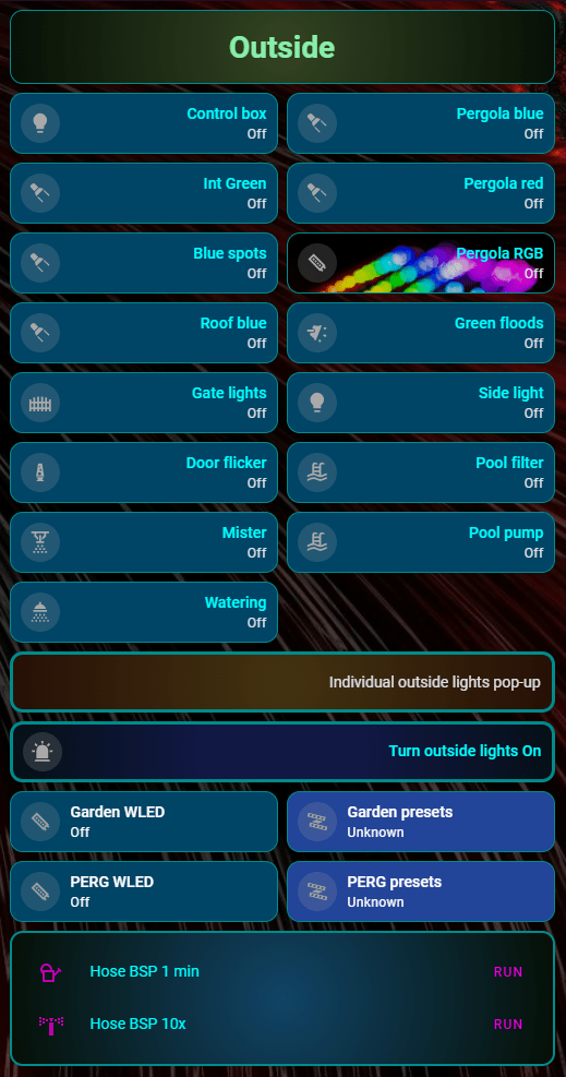
My current main control page – which is about to have individual lighting controls collapsed – I already have the control in place to expand out individual lights for “outside” but not yet removed the originals. Looking at the left column you’ll see I can save lots of room by collapsing the individual light controls.
Rather than show you the main control page full width from my PC screen (which would be illegible on the blog) I’ll show you the first column. Firstly I have “outside”, then “Office”, “Living Room + Kitchen” then “General”. When editing, a “custom: bubble card will show – which is invisible normally
So… “Outside”.. firstly I mentioned formatting – then popping up individual lighting – right now I have both the pop-up control button AND all the outside lights displayed – the latter are about to be hidden now I know how to expand and contract them. All the lights are off in the image above – and I’ll firstly show you what happens when I hit the “Turn outside lights on” button.
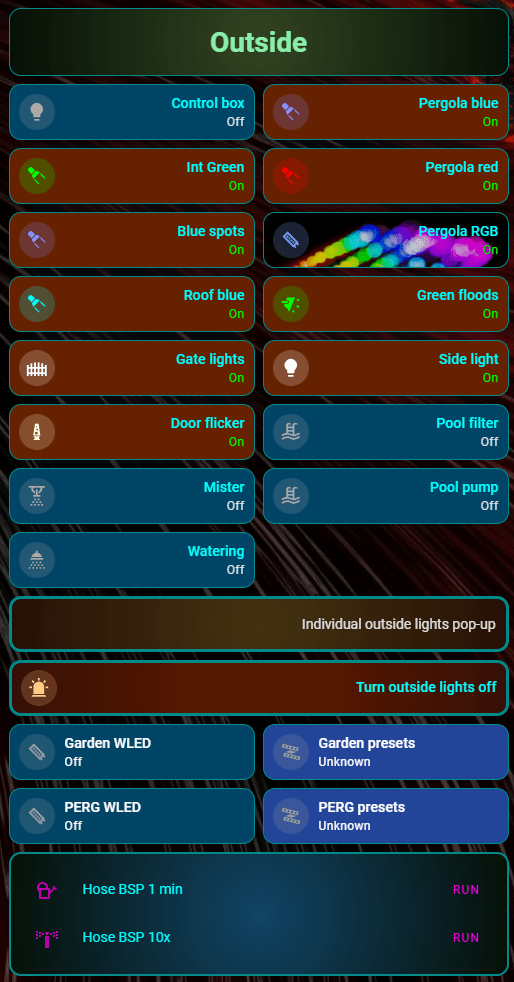
Note that the icons for the lights change colour – and the backgrounds change colour. That was my first success befoer moving onto gradients. The lights which are ON are showing with orange backgrounds, blue when off. In practice it’s very obvious what’s on and that isn’t. This is all thanks to conditional controls. The wide control that now says “Turn outside lights off” is an example of conditional secondary text control.
Taking the “Pergola Blue” light, so called as it’s a blue LED strip, If I go into EDIT mode for that button, you’ll immediately see in the control, that I’ve used the “mushroom template card”. Why? because I could not get the control I wanted from the simple “tile” card. As you’ll see later, I’ve also used the “card-mod” tool which you can freely and easily add to HA and without which I could not manage to achieve the formatting I want. The downside of this is that I can no longer solely rely solely on the simple visual editor” and usually resort to using the “code editor” mode – which is not anywhere near as bad as it might seem.
Using the code editor mode lets you directly change the YAML code for, in this case, the Mushroom template card. I have only one gripe with the code editor – the editing window is fixed-width and far too narrow IMHO – but to offset that – as with the visual editor – you can test a control WHILE EDITING and if your change doesn’t work – simply cancel the edit. That is VERY POWERFUL especially if your concentration, like mine, is far from perfect.
Imagine using a separate text editor, messing up the whole lot and only realising that after it’s too late. This scenario is made worse because when editing HA files, you can’t just comment out a line and insert its replacement… when you finish editing – HA will automatically remove such commented-out code. I know of no way to prevent this.
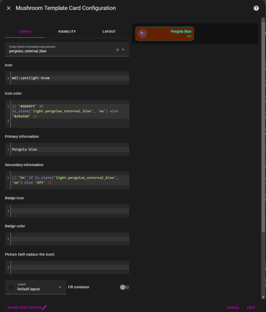
Lets take a quick look at the visual editor for my Pergola blue light…
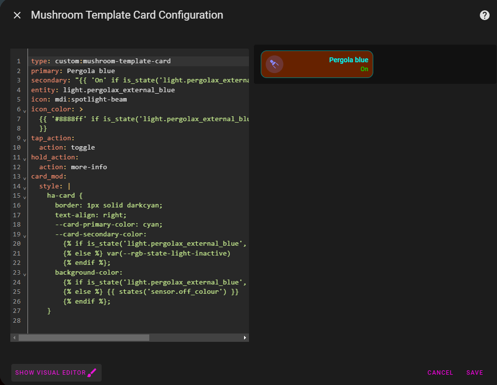
It is only showing the main code – but offers several easy to use options (see the 3 tabs at the top – config – visibility – layout). Now look at the “show code editor” link at the bottom of the above image and the resulting code below:
The code window above is EVERYTHING needed to get a working button.How much nicer would it be if we had the option to take that (orange) button image, put it underneath the code and make that code window full screen width – but hey, it is what it is. So in my “pergola blue” light control, in a standard “tile” I’d originally click on the icon to turn the light on and off (tricky on a phone if you have big fingers) and elsewhere on the button for other options – it is all too easy to end up clicking away from the actual small icon by mistake. Here, with the mushroom template card, I can click once anywhere on the button for on-off toggle – and long-press anywhere on the button for other options (this is a blue light, were it a full colour light, HA would magically let me see and use the light colour and intensity controls on that long-press).
To the code: Lets see it expanded without that somewhat narrow, non-text-wrapping window…
type: custom:mushroom-template-card
primary: Pergola blue
secondary: "{{ 'On' if is_state('light.pergolax_external_blue', 'on') else 'Off' }}"
entity: light.pergolax_external_blue
icon: mdi:spotlight-beam
icon_color: >
  {{ '#8888ff' if is_state('light.pergolax_external_blue', 'on') else '#a9a9a9'
  }}
tap_action:
  action: toggle
hold_action:
  action: more-info
card_mod:
  style: |
    ha-card {
      border: 1px solid darkcyan;
      text-align: right;
      --card-primary-color: cyan;
      --card-secondary-color:
        {% if is_state('light.pergolax_external_blue', 'on') %} #00ff00
        {% else %} var(--rgb-state-light-inactive)
        {% endif %};
      background-color:
        {% if is_state('light.pergolax_external_blue', 'on') %} {{ states('sensor.on_colour') }}
        {% else %} {{ states('sensor.off_colour') }}
        {% endif %};
    }
Above – the “primary” text shows wording “Pergola blue”, my chosen title for the button. The secondary text i.e. “On” or “Off” is conditional on the state of the light – in this case an HA ENTITY called light.pergolax_external_blue (as you type in the name, the editor attempts to autocomplete based on available options so that’s not as hard as it might look). I’m also specifying the entity (mandatory) just below (the order isn’t important) – same autocomplete applies.
Next I specify which icon I want (or none) from available icons – in the basic setup, all basic icons start with “mdi:” and there are MANY available icons and lots of add-on sets available. Without the autocomplete, you could spend all day finding something suitable.
Next the icon colour: Again I’ can’ve chosen to select the colour depending on the on/off state of my light. I’ve picked two html hex colours for on and off respectively – I could have simply used “red” and “blue” or even “steelblue” but that is so limiting and assumeds you rmembre all the availabel HTML colours – the hex colours comprise a hash then 2 hex digits for red, 2 for green and 2 for blue. Easy once you get started. If you have to remember a whole bunch of colour names – isn’t it just as easy to keep your favourite colour hex values (FF is full brilliance) in notepad?
Next is the tap-action: i.e. what happens when you tap the button – in this case toggle between on and off. Then hold-action – by default this is whatever HA believes you can usefully do with your device – this opens up a window to let you control colour if applicable, intensity etc… but to describe that I’d be here all day. Thank heavens for default settings – I rarely need to manually alter “hold action”.
Then we move onto the card-mod: section, definitely NOT default and I had to figure out from examples spread all over the web, just what I can do with this marvellous add-on which lets you make so many settings that you’d think should be in all standard cards – which which often are not – depending on the card. The standard “tile” card regularly needs the help of card-mod.
See “text-align: right” – well, that DID work in the standard “tile” to properly move text over to the right with sensible padding – but then on say, months ago that no longer did the job – my main reason for getting to grips with card-mod initially.
Above, I made the primary text simply cyan (my choice) but the secondary textI’ve chosen to make dependent on the state of the actual light. I did the same with the backgound colour.
By now this should be becoming easy to fathom so lets move to something beyond simple colours. I’m going to show an example of a conditional colour gradient for the backgound – note that even with card-mod, not all card “types” support this – hence my careful use of the mushrom template card.
Note in the code below, again inside card-mod – I’ve changed from “background-color” to just “background” – this is VERY important” and otherwise this code will fail:
      background:
        {% if is_state('light.athom7w_1', 'on') %} radial-gradient(circle, #882800 30%, #461006);
        {% else %} radial-gradient(circle, #113864 30%, #261033);
        {% endif %};
Above instead of a colour enclosed in twin braces, I use an inbuilt CSS function which takes 3 arguments – the first could be “circle” (no quotes) or one of several alternatives, then the ON colour, then the OFF colour – the percentage is optional and can be used or not in either of arguments 2 or 3. For square buttons or charts it is not needed, for wide buttons I found it produces a better effect. In all of this, sorry for constantly changing the spelling of colour – Americans say “color” and possibly for that reason, HA uses it – I on the other hand am English and for us the correct spelling is “colour”. Most of the English-speaking world is on my side – but HA is not forgiving even the original author of HA was/is Paulus Schoutsen which doesn’t sound American – thinking about it the CSS standard uses color – maybe that’s ti .
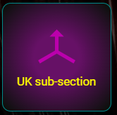
Here is an example of a card using that circle background gradiant effect. I love it…
You can see the purple background fading to almost black near the edges. You have complete control over this as in the “background” YAML I showed above.
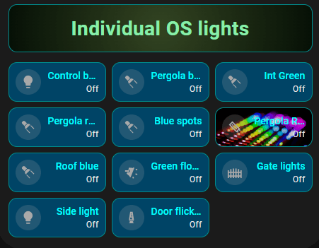
And now, that pop-up for the lights I spoke of – the button controls the popup and the actual code as I mentioned is hidden until needed – below you see a card of type “markdown”and another of type grid then the first of several cards representing each light – I’ve only shown the first. The reason they are buried in a type: vertical stack is as suggested by the author of the custom:button card. I’ve also found elsewhere that embedding cards in a horizontal stack, cards whose width won’t behave repeatedly over PC and mobile browers, can be helpful. We’re basically talking in each case about adding 2 short lines and indenting subsequent type: info. See below – various type: lines are indented and prefixed by a minus sign.
type: vertical-stack
cards:
  - type: custom:bubble-card
    card_type: pop-up
    hash: "#myhash"
  - type: markdown
    card_mod:
      style: |
        ha-card {
          border: 1px solid darkcyan;
          background: radial-gradient(circle, #334422, #061006);
        }
    content: "# <center> <font color=\"#88eeaa\"> Individual OS lights</font></center>"
  - type: grid
    columns: 2
    square: false
    cards:
      - type: custom:mushroom-template-card
        primary: Control box
        secondary: "{{ 'On' if is_state('light.pergolax_control_box', 'on') else 'Off' }}"
        entity: light.pergolax_control_box
        icon: mdi:lightbulb
        icon_color: |2-
            {% if is_state('light.pergolax_control_box', 'on') %}
              #ffffff
            {% else %}
              #a9a9a9
            {% endif %}
        tap_action:
          action: toggle
        hold_action:
          action: more-info
        card_mod:
          style: |
            ha-card {
              border: 1px solid darkcyan;
              text-align: right;
              --card-primary-color: cyan;
              --card-secondary-color:
                {% if is_state('light.pergolax_control_box', 'on') %} #00ff00
                {% else %} var(--rgb-state-light-inactive)
                {% endif %};
              background-color:
                {% if is_state('light.pergolax_control_box', 'on') %} {{ states('sensor.on_colour') }}
                {% else %} {{ states('sensor.off_colour') }}
                {% endif %};
            }
        grid_options:
          columns: 6
          rows: 1
In practice the code above has several mushroom cards one after another (all but one of which I’ve taken out here rather than make the blog extremely long – they’re all the same except for primary wording and the light entity referred-to)…. and the reason for the “- type: grid” with 2 columns is to get 2 side by side as you might by default in a simple type: tile arrangement. Simply changing the columns line to “3” would produce narrower buttons.. but then I’d have to use smaller text.
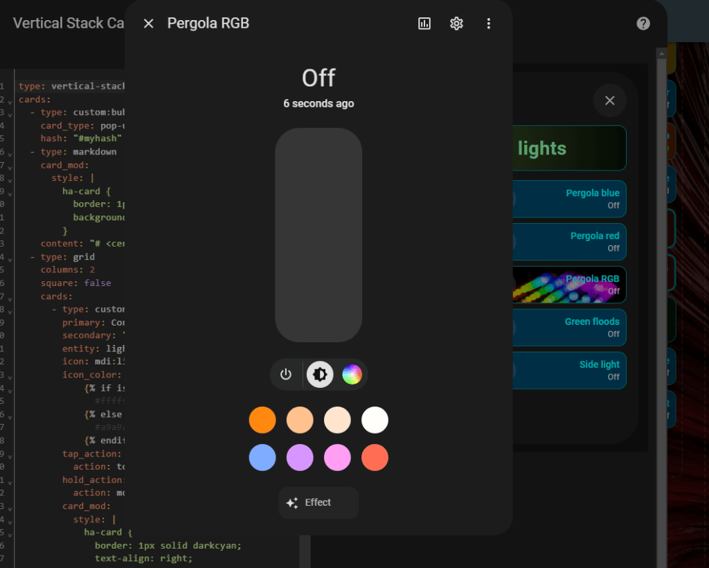
Take a look at the Pergola RGB button above – long-clicking on that produces in my case (automatically – I didn’t write anything – just told the button it is controlling an RGB LED) a pop up control for the RGB LED and all of this works WHILE I’M EDITING in the HA code editor.. so much for “just use an external text editor” – bad idea.
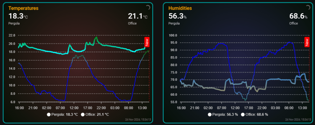
As I learn more I’ll expand on this – meanwhile here are a couple of “Apex charts” showing temperatuer and humidity outside and benefiting from the use of gradiant background. Apex Charts is easy to add to HA. For more on Apex charts – search “home assistant apex charts” – vast amount of info available. I’ll expand on this soon.


