In csae anyone has noticed the blog slowing down recently I’ve been hammering away at my blog service provider who advised me to get WP-OPTIMISE – and I’m now using a licenced version of that on the site. There are countless images in here so you can imagine that any optimisation of these has to be worthwhile as well as optimising the database tables. Time will tell but I THINK the site is loading faster – let me know about your experience.
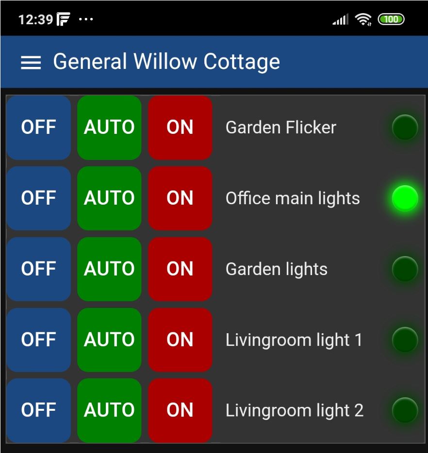
Meanwhile I’m quietly beavering away at the pretty Node-Red-Dashboard buttons I mentioned here. Working a treat but I’m still working on image versions… see the blog entry and please don’t be shy about offering advice…


Hopefully just coincidence, I think somewhat over 1000 newsletters went out (caught the number in the corner of my eye) and this is the first response about images… let me know if it happens again.
Pete
It may be a coincidence, but the images in this newsletter didn’t open in my e-mail system, they were just “this image cannot be displayed” messages. I had to open it in my browser to see them.
My e-mail client is Windows Outlook under Windows 10.
Yes! It is loading much, much faster.
In the weeks past it has been painfully slow, were it not for the content, I would have given up 😉
All code and images now in the blo. Background issue solved, had to abandon md-utton for images and go back to button – but I’m stuck right now with css in the button – need to get it all in the support template and pref make a new button type based on button with the mods seen (could call it ps_image_button for example) – I need help from someon with more CSS experience than I have.
Thanks Chris – and others for the kind words – appreciated.
Loading much faster for me in USA. Good work.
The site does seem to load quicker – it must be massive by now. Re the buttons and other effects I’m always blown away by what some people have achieved with CSS and a little JS over at codepen. This page for instance has a number of effects you could copy if they appeal. https://codepen.io/kjbrum/pen/wBBLXx
Thanks Steve – I’ve just updated the item about buttons – all fixed except for (on non-rectangular IMAGE buttons) removing the default highlighting which blights the corners. Any ideas?
What is image button?
Hi Petslane
An image button, instead of having a background colour (a tad boring) and a highlight colour (which I’ve made yellow above) uses a .png image (on my PI in the NODE-RED public folder I have folders called myImages and myIcons – I’ve blogged about that – and so the button can use an image as the background and another image for when pressed…. but as I’m using round images – and I’ve made the background transparent (don’t want to rely on a particular dashboard background) I’m seeing a default highlight grey colour when you press a button (only in the transparent corners). I need to know how to turn that off.
can you provide example code so I can understand the problem.
do I understand correctly that you have rectangular and transparent button, containing background image that looks round and when you press, then corners became gray (or yellow if ‘highlight’ class is used)?
if i understood you correctly, then:
– option 1, make button also round with css property ‘border-radius’
– option 2, use ‘:active’ css selector to overwrite default background color to transparent